When you’re growing your brand, you need to focus on different aspects that will help you grow. Your website design is one of the most prominent factors. Not only is it your online profile, but it also contributes towards growth.
Your website is your portfolio. One minor mistake can be a dent in your reputation. It is necessary to have basic criteria that will help to build your brand reputation. The website design should be user-friendly and helps to boost sales.
Is website design necessary?
Now that your entire business is going online, you need to focus on creating a compelling design. You shouldn’t follow the league and try to build unique websites. Poor website design will not only cost you a lot of money but will also affect your reputation. Furthermore, it will also prevent you from getting new customers.
Not many website owners understand the importance of good design. Having poor website design will make it extremely effective in the long run. It is necessary to make the choices carefully to get easy fixes. Moreover, minor mistakes in your website can lead to poor user-friendliness. If you want to get better leads, you need to work on choosing the website accordingly.
A good website has flawless design and will leave your users baffled. It is necessary to put your best foot forward to get the best impact. Website design is a topic that is everywhere.
Not only does your website contain design, but it also focuses on navigation, speed, and strategies. This will play an important role in enhancing the aesthetic appeal. Right from informational content, website design also focuses on visual concepts. The design helps to functionalize the basic aspects.
It is necessary to implement user experience, interaction, navigation, and animation accordingly. Hence, it is crucial to have a good website design to help you in the long run.
What are the common website design mistakes?
If you are planning to build your website, you need to start from the basics. Website design is like an art that is a combination of function and form. If the website design is accurate, it will make it more fun to use. Furthermore, it is also necessary to follow the rules while building a website.
Some of the common mistakes to avoid for a website design include the following:
1. Lack of call to action

Lack of call to action is one of the greatest things that many people face. Whether you are a small website owner or big, it is crucial to have a good call to action. Your attractive call to action is what attracts the attention of the user.
On your website, you will answer many questions like what to do, how it looks, and where we should go. Furthermore, the website design with a clear call to action allows your visitors to understand the next step.
Whenever you include calls to action in your website, you need to be very clear with the aim. Moreover, you should also describe services and products. Nonetheless, the call to action shouldn’t be exaggerated. It is necessary to choose a simple website design. If the website design is short and precise, it will become prominent. You can take inspiration from the internet to implement the best call to action.
2. Not focusing on responsive design

Website security is extremely crucial, and it will play an important role in boosting responsiveness. Website security is a technical feature, but it has a lot of impact on its reputation. The designers need to focus on implementing the design security.
The website security is determined in the design stage only. It is necessary to avoid loopholes that can have a negative impact. Therefore, you can focus on authentication and payment wall security. Apart from security, it would help if you also focused on the consistency and responsiveness of the website.
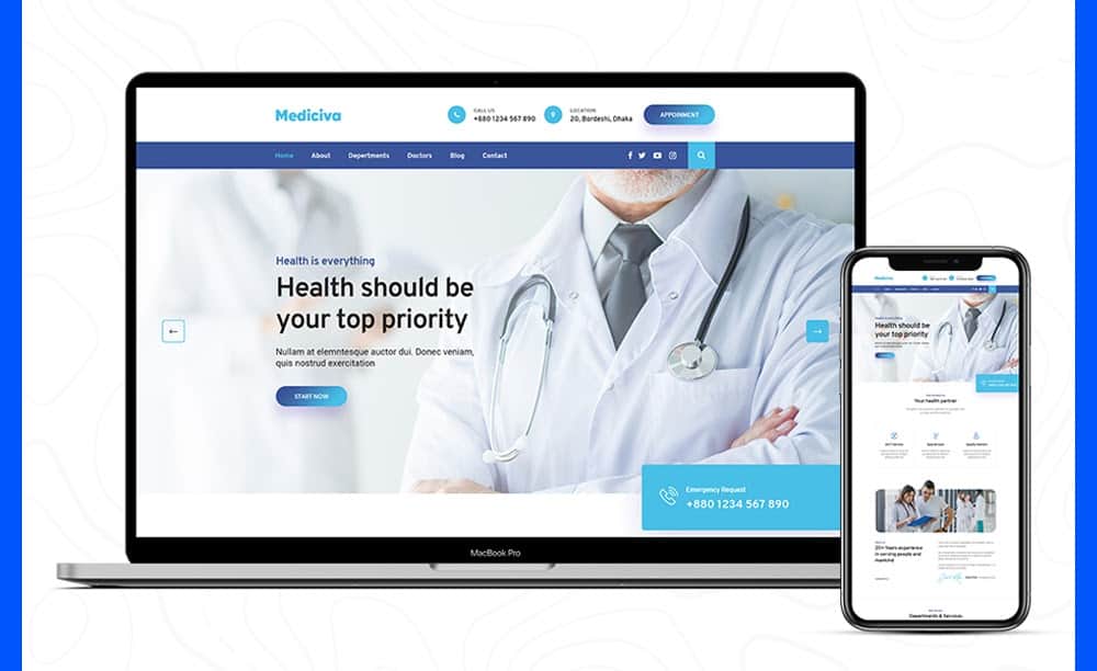
One of the main mistakes that most designers make is not focusing on security and responsive design. No matter which platform you are building the website from, you need to maintain consistency. Before you make the website live, you need to check the responsiveness of the website. There are several websites like LambdaTest and LTBrowser that can help to test the responsiveness of websites.
The basic difference between both of them is in adaptive relies on changing the design pattern
to fit the real estate available to it. At the same time, the responsive approach shows content
based on the available browser space. Going by the responsive approach may yield better
results as it’s much more affordable, easier, and takes less work to implement.
In this approach, testing responsive websites is also important. Choosing the right tool is very
important as it should be compatible with a variety of phones, their operating systems,
browsers, etc. The content, videos, images, links, a combination of commonly used operating
systems, browsers, and screen sizes all need to be tested and should be a priority before
releasing the website for various platforms.
3. Weak search engine optimization

Search engine optimization is highly beneficial to the growth of websites. However, this is also one of the factors that will bring down the quality of your website. Your website’s SEO is what will build or break your website.
Nonetheless, one of the main aspects that many website designers fail to implement is search engines. Website SEO will play an essential role in getting organic searches. Moreover, it is not easy to get high rankings overnight. Gone are the days of keyword stuffing, plagiarized articles, and basic design mistakes. Minor mistakes can eventually lead to your website being penalized.
Moreover, poor website design can also lead to a website losing its authority. Whenever designers are implementing search engine optimization, they will need to focus on some important aspects. These include:
● Long-tail keywords
The use of long-tail keywords can be helpful. Moreover, it is necessary to use keywords accurately so that they can bring better leads. The website is optimized, and it will help the website to rank in higher positions.
The keywords you use for defining your website should be relevant. However, the use of one phrase can pave the way for getting more relevant keywords. Whenever using long-tail keywords, it is necessary to ensure that they are interrelated.
● Post content regularly but maintain quality.
You need to post content regularly, but you should also maintain quality. Posting poor quality, plagiarized content can lead to penalization of the website. A poor-quality website will never attract the attention of your users.
It is necessary to post fresh and informative content. High-quality content is as important as SEO. The concept of Content as King is still relevant. It is advisable to post content that is relevant to your website and helps to build a brand. However, as per guidelines, every content should be around 1000-1500 words. Nonetheless, depending on the requirement, you can write more words.
● Social media engagement
Social media engagement is highly crucial to your website. While SEO can help you generate organic traffic, social media will also help you get traffic.
You should be active on various social media platforms like Pinterest, Facebook, Instagram, and Twitter. Being active on social media will play an important role in boosting your brand identity. Furthermore, it also helps to build your brand identity.
You can include social media buttons on your website. Additionally, you can also include the social media sharing buttons for your post. These small aspects will play an essential role in getting higher ranks.
4. Poor Hierarchy

For smart website development, the page should be efficient and capture a reader’s attention so that the viewer can easily understand and excess the information they need.
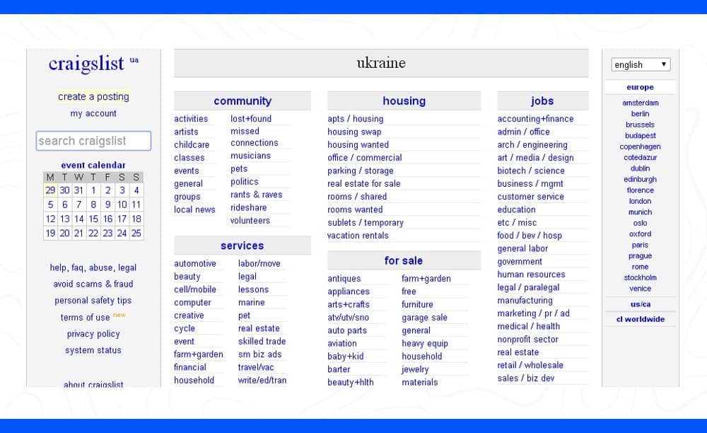
But in some cases, developers tend to miss the trick. For instance, on some websites, it can be seen that a lot of cluttering takes place on the landing page. It gets confusing for the user on what to do next, which is quite frustrating, leading them to exit the page.
Here is where hierarchy comes into the picture. Hierarchy is the presentation and arrangement of the elements in the website, which in a way implies importance and captures your user’s attention.
A well-structured website should help people navigate around the page. The hierarchy of the page should be maintained in such a way that a visitor should be able to identify and distinguish between the various parts of the page section. For people who are having learning disabilities and visual impairments, mobile web users or people using certain browser plugins, proper hierarchy
architecture can help any user to easily find and prioritize content on the page.
Not giving importance to the content of the hierarchy is one of the common mistakes
made by the developer. A well-constructed content hierarchy is a difference between a website with a great conversion rate to one which is poor. The content hierarchy should be
such that the goals of your website should match with the majority of the visitors of the page.
What the consumer is seeking from the page, what benefits the visitor receives from
consuming your content and how desirable. Distinctive content experience can be consistently
delivered on the page are some of the questions that a developer has answers to will help drive
more traffic to your business.
5. Image-Text Contrast

The first impression can make or break one’s perspective. The same goes while going through a website. How your viewer perceives and interacts with your website is an important aspect a developer should keep in mind.
A website with poor choices for foreground and background color, flashing graphics -in short, a bad image and text contrast; are some of the common web design mistakes which can lead to loss of user interest and harm the business.
Hence the visual appeal of a website is something every designer should take care of. The visual appeal should be aesthetically appealing, findable, usable, accessible and attractive, which immediately makes the site more appealing.
A website should be high on readability and easy to navigate so that the visitor easily reads and understands the texts on the page. A highly readable website attracts more viewers than a poor one. Readability depends on how the text and context are presented on the page. There are a number of readability and editing tools that can help a developer improve the outlook of the website.
To increase visual content appeal, careful selection of color schemes and color usage is very important. Keep this in mind, especially when you are dealing with designing fonts and backgrounds in modern web pages. You need to use the best colors and fonts for maximum readability so that the user feels welcomed and gets the information with the least effort.
It should be noted by the developers that the number of colors they use in the design is an important aspect to consider. Too many colors become visually distracting. So, simplifying the color scheme of your site makes it easier to focus.
It should be noted by the developers that the number of colors they use in the design is an important aspect to consider. Too many colors become visually distracting.
6. Ads in wrong places

Ads are crucial for the growth of a website, but inserting them in the wrong places can be costly. Advertising is a blessing as well as a disadvantage. It would help if you were very careful about where you insert the ads. Some of the common places where you can insert ads include blogs.
While ads help to generate revenues, including them, too many of them can be harmful. Before inserting ads on your website, you need to check them. If the ads appear weird and annoying to you, it is a big No-No. Apart from ads, it would help if you also focused on including pop-ups on your page. Many websites have pop-ups that keep coming back. Such kinds of pop-ups are very annoying.
You need to ensure that the pop-ups on your website are easy to close. If the pop-ups keep coming back and cover your entire screen space, it can be extremely harmful. Before including the pop-ups, you need to focus on your target audience. Your planning should align with each other to get accurate results. If you are digitally building your website, make sure everything is in balance.
Another important principle in web designing is balance. It gives stability and structure to your design. Balance can achieve a good arrangement, which creates emphasis on important pieces of your design. One of the common mistakes made by the developer is the proper and perfect use balance. Understanding balance will help you to understand when to use the correct type in different circumstances.
Bonus: Taking it slow
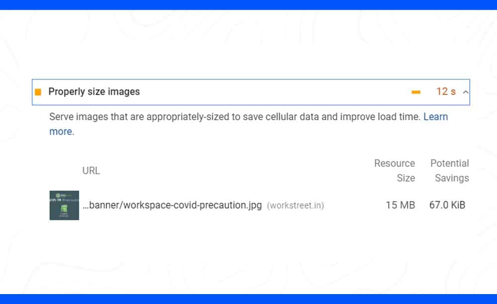
As per the Google algorithm, any website with a load speed of more than 3 seconds will be in trouble. No audience is interested in your website if they have to wait for long to access the information.
Everyone is on the internet to get information fast. Well, if your website takes too long to load, no one will visit your website. Furthermore, it will also affect the search engine rankings. If your website is designed accurately, the load speed wouldn’t be high. Furthermore, it will not affect your creativity too.
Final Thoughts
The website is an asset for your business. So, you should avoid making even the slightest mistake. On the verge of creating a flawless design, do not forget to take care of the basic needs.
However, these are common website design mistakes that you can easily avoid. While you can quickly fix them, you may have a tough time recognizing them. Therefore, you should know about these mistakes from the start so that you can avoid them easily.
It is time that you move past the minor mistakes and not commit any of these. Not only will it affect the business but also your reputation as a website designer.
Author Name: Khurshid Alam.
Author Bio: Khurshid Alam is the founder of Pixel Street, a web design company. He aspires to solve business problems by communicating effectively digitally. In his leisure, he likes to read, write and occasionally play a game of table tennis.


